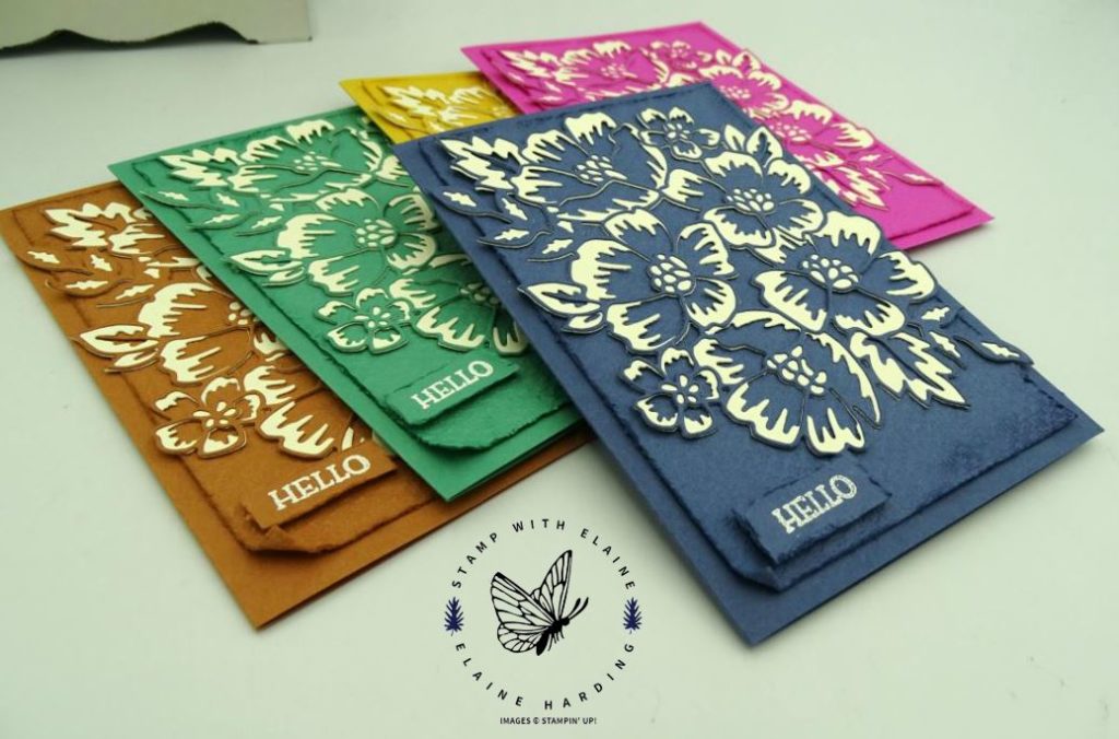
Have you had a chance to familiarise yourself with the new In Color names? It never ceases to amaze me how they think these up! During the pre-order period, the new In Color inks were not available so I did a work around.
The “shading” effect was cut from Very Vanilla card stock. To work around not having the inks, I white embossed the sentiment. Corresponding layers were embossed with the new Tasteful Textile 3D embossing folder (page 122 from the In Good Taste Suite). I distressed the sides by running the edge of the scissors and sponged it with darker shades of coordinating ink.
- Cinnamon Cider – Soft Suede
- Just Jade – Shaded Spruce
- Bumble Bee – Crushed Curry
- Magenta Madness – Melon Mambo
- Misty Moonlight – Night of Navy
The In Color cards had very little stamping except for the sentiment. Consequently, I thought I’d make one with some stamping to showcase Stampin’ Up!’s dist-ink-tive photopolymer stamps.
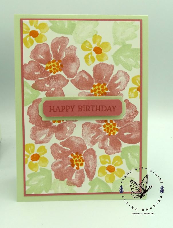
I’ve neglected last year’s Rococo Rose, so I thought I’d give it some love and paired it with Soft Sea Foam. The five Rococo Rose is just one stamp and it is Stampin’ Up!’s patented dist-INK-tive range where light and shade has been incorporated into the stamp.
Would you like to see how it came together? Here’s the video –
")
")


I hope this has inspired you – thanks for visiting.

- SHOP ONLINE – EARN 10% REWARDS ON ALL PURCHASES OVER £20
- PURCHASE A STARTER KIT : Get £155 worth of products for only £99. Choose from current catalogues and any specials available. Free Shipping. Read more
- Subscribe to my Video Tutorials – click here